Portfolio V1
From 2022.
Minimalistic. Strictly sans serif. Only two colors. The 2022 version of my portfolio was focused on exercising what I've learned about accessibility and animation.
A walkthrough scrolling down the homepage of my portfolio from 2022.
It featured a custom drawn, doodle-like SVG hover animation on the navigation links, thoughtful tab ordering, skip to main button, a "3D" rotating text animation (that I've repurposed for my current site). Unlike my current portfolio — the one you're currently scrolling through — it had dark and light themes, toggle-able by a rotating button at the bottom right.
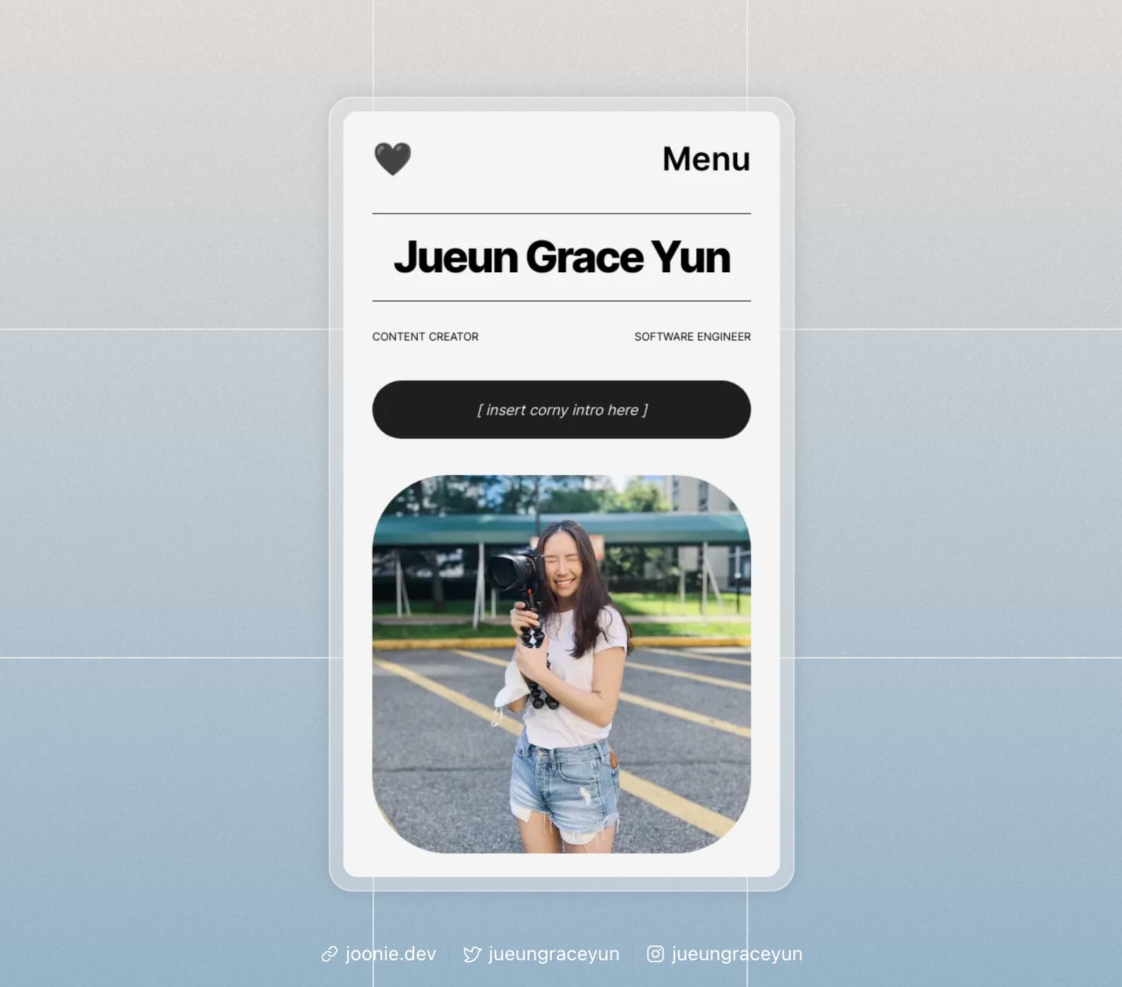
Before landing on my current design, I had been working on another design; think soft gradients, grainy, lots of icons. In the end, I landed on what I have today because I wanted to stay minimal rather than going in the other direction. Compared to 2022, my current site is less liberal with animations, prioritizing speed — and introduces more fun colors!
Last, I've open-sourced the code the rotating text on my GitHub. Check out the demo here!